This interesting post by Nathanael Lauster caught my eye last week looking at the gradual shift in age-specific birth rates for women in British Columbia over the last few decades. Nathanael is a Professor of Sociology at UBC and you may have heard of his book “The Life and Death of the Single-Family House”.
Too pretty not to share: illustrating the Great Wait, a.k.a. the gradual shift in timing of childbearing in BC. #demographics https://t.co/LbS3UfBq0G pic.twitter.com/npZc8zNnQf
— Nathanael Lauster (@LausterNa) February 13, 2018
His post includes a striking visual showing the shift in age-specific birth rates for BC between 1989 and 2015. You can really see the year-by-year progression of BC women having more of their children at a later age.
I really liked what this chart showed and wanted to recreate Nathanael’s Great Wait chart using tools more familiar to myself. All the code for processing data and creating charts is at the end of the post, and, as always, the full R Markdown code for this post is on Github.
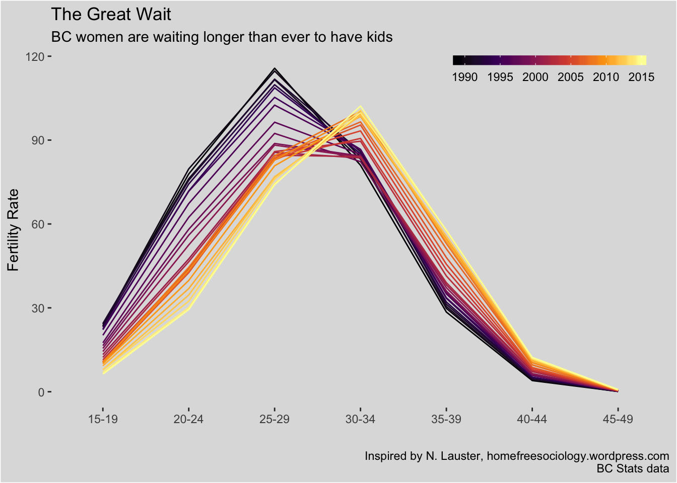
Fertility rates are provided for discrete age-specific cohorts, although ideally we would have fertility rates by year. The discrete cohorts lead to straight lines and angles. We can use X-splines with a shape adjustment parameter to simulate interpolation and produce more aesthetically pleasing curves that better resemble birth rate curves. X-splines are available as geoms in the ggalt package.
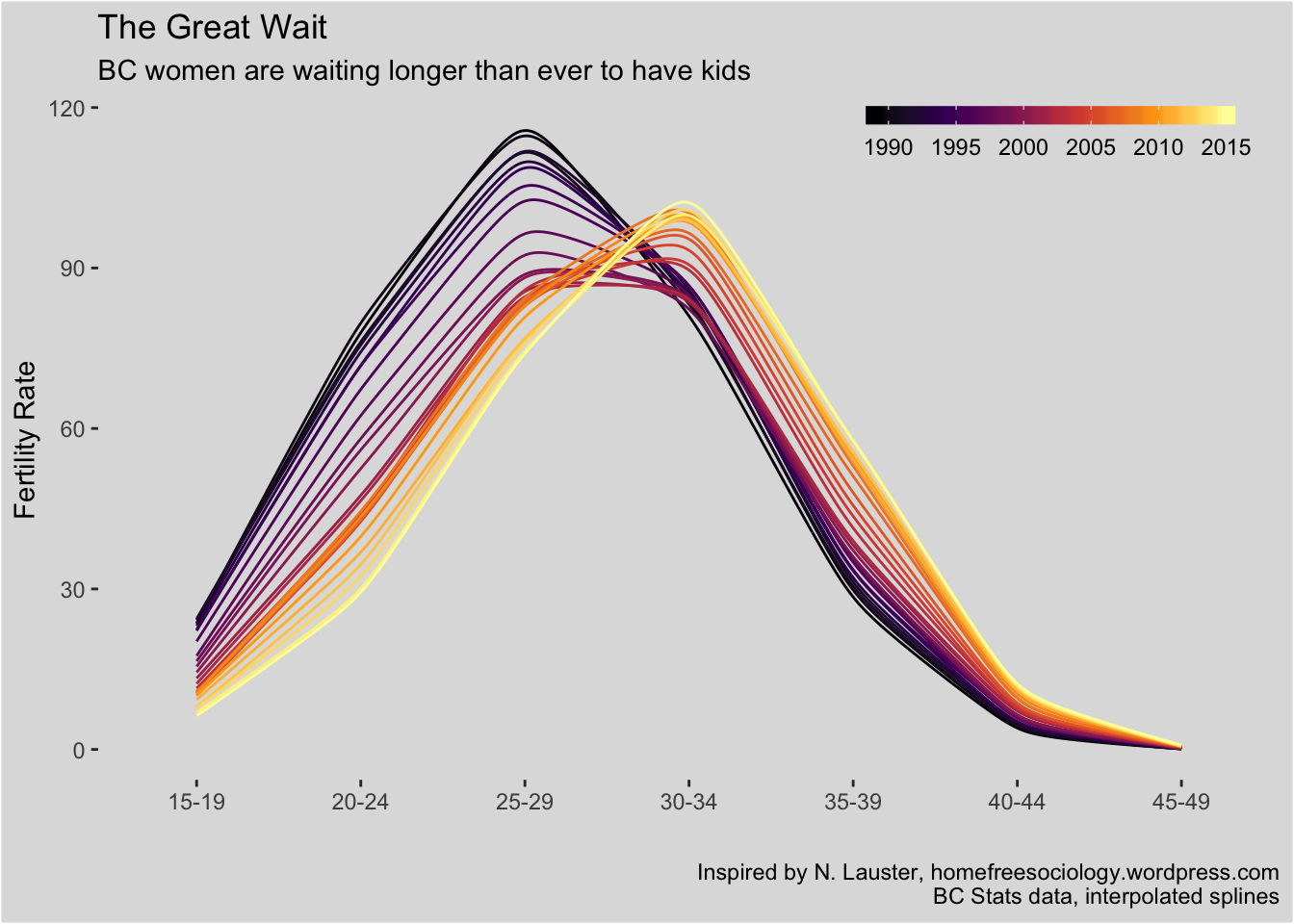
Note, there are far more accurate interpolation approaches specifically for age-specific fertility rates, but they are far more involved.
A rich dataset
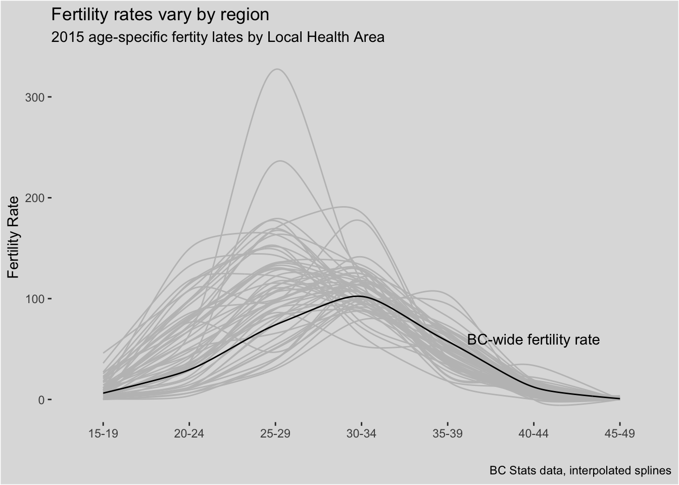
The underlying dataset is rich, providing age-specific fertility rates for BC Local Health Areas (LHA). Many vital statistics in BC are provided for the five “Health Authority” levels which are then broken down into Health Service Delivery areas. These are further subdivided into Local Health Areas, of which there are 86.
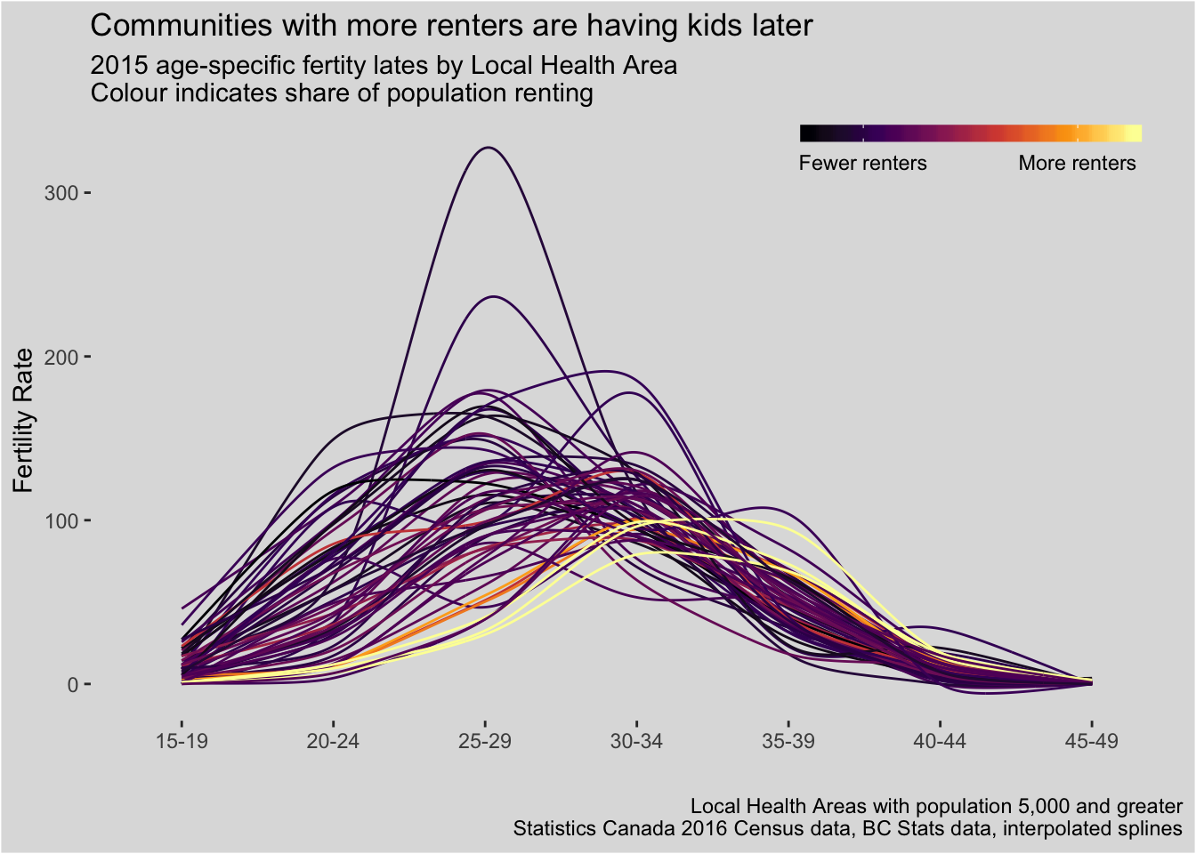
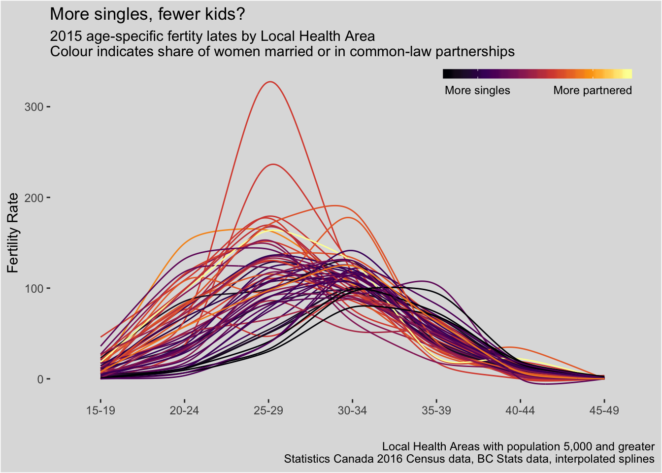
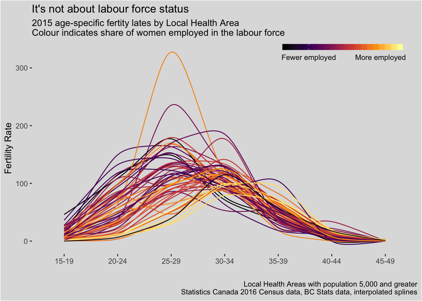
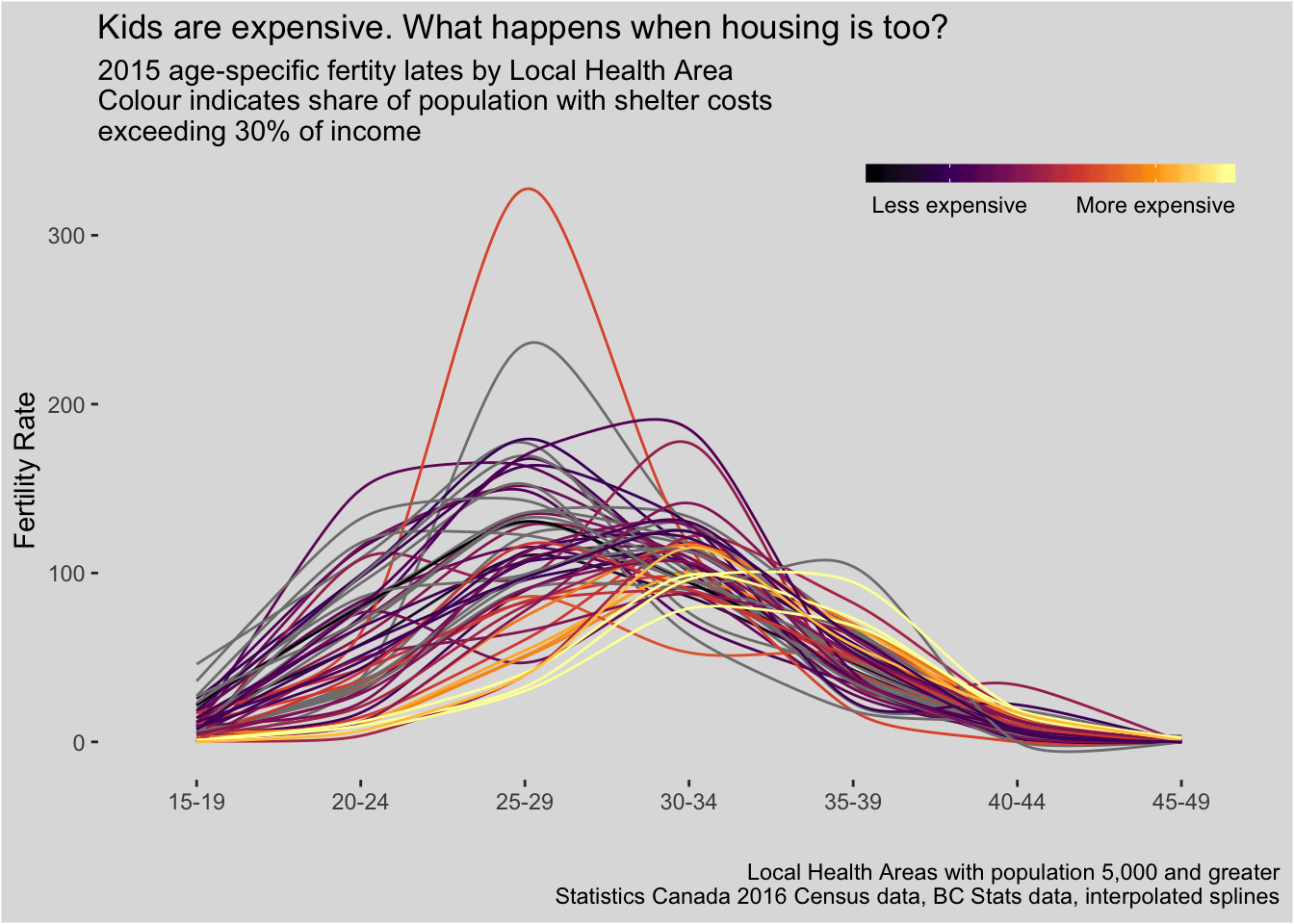
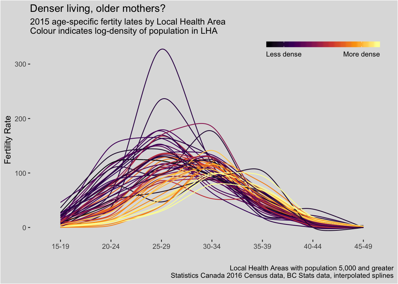
When we look at all the individual Local Health Areas, we can see that, at least for 2015, there’s actually a fair amount of difference in their profiles.
Causes and implications
I recommend reading the original post, as Nathanael gets into more detail about some of the causes and implications. I wanted to explore whether some of these differences in birth-ages by area could be associated with differences in demographic characteristics within these areas. Fortunately, BC Local Health Areas can be mapped to Statistics Canada’s Census subdivisions, and Census geography means we can turn to Census data which, as you may have suspected, means cancensus time. Using a modified version of the BC Stats region translation table, it’s pretty easy to turn Local Health Areas into a Census region list compatible with a cancensus get_census call. The code at the end of this post shows all the pre-processing steps for anyone interested in that side of things.
Combining the most recent Census data with the most recent fertility rate data (from 2015), we can see whether, as an example, age-specific birth rates vary with female post-secondary education attainment levels.
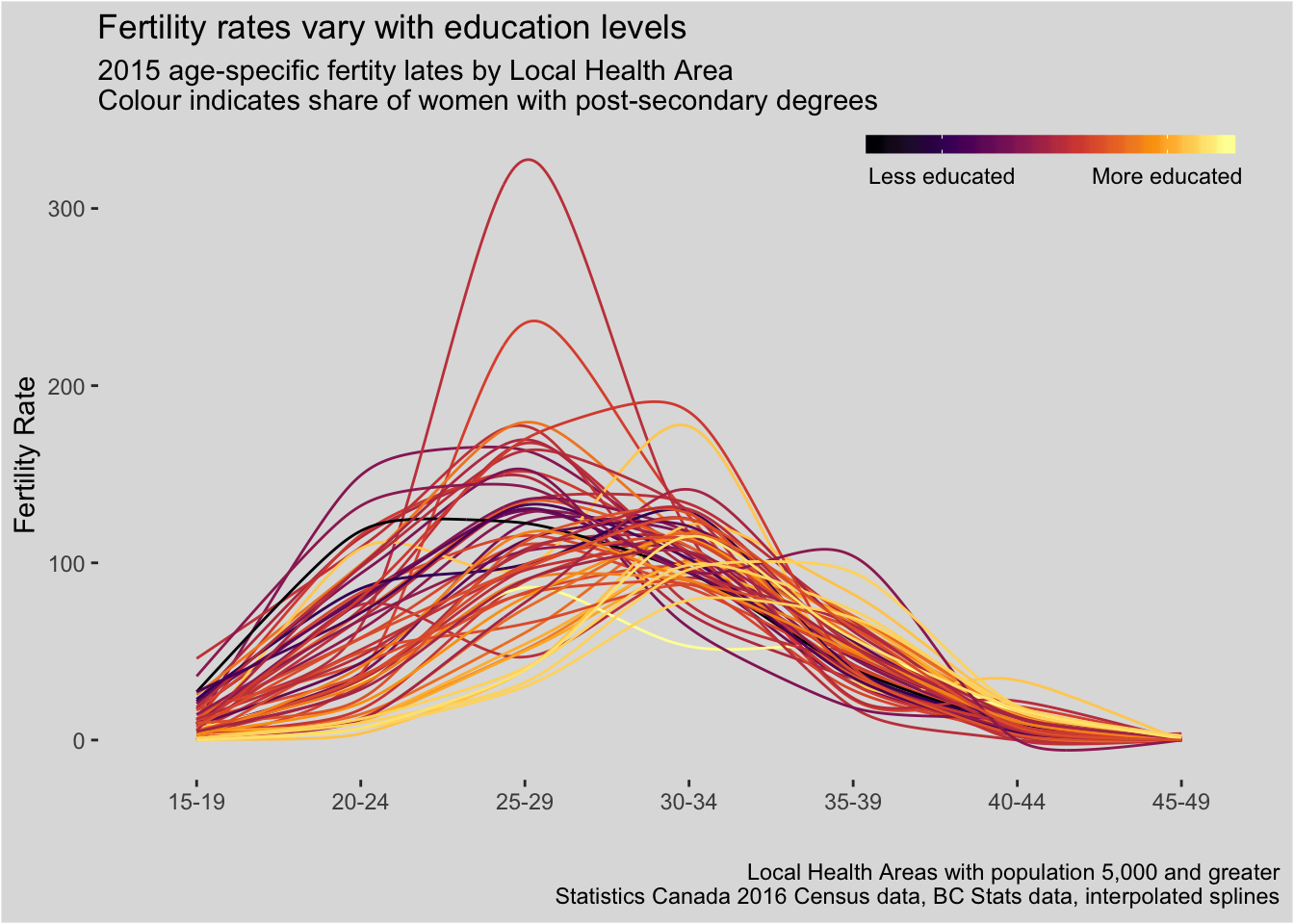
All in all, I selected a few different Census characteristics to look at: education, employment, partnership, housing tenure, shelter costs, and calculated density. This is not meant to be an exhaustive list of potential explanatory variables - many of these will be highly correlated with one another in any case. But this is not an attempt at determining any kind of causal relationship, a problem that is surely well studied already by the experts in this field. Rather, this post is a superficial visual exploration, but it is one that I wanted to share - so let’s take a look.
Pre-processing code
library(dplyr)
library(readr)
library(tidyr)

library(ggplot2)
library(ggalt)

library(cancensus)

# Download fertility rate data frin vc stats
bc  <- read_csv("http://www.bcstats.gov.bc.ca/Files/c2a9caae-628d-4fac-9e7b-20511ca84c2e/AgeSpecificFertilityRatesbyLHA.csv", skip = 3) %>%
  filter(!is.na(RegionID))

# Tidy up
bcl <- bc %>%
  tidyr::gather(age, fr,`15-19`:`45-49`)

# Custom LHA <-> CSD lookup table
lha <- read_csv("https://gist.githubusercontent.com/dshkol/f3c32e173c54e03bf938b0e1d61a47d3/raw/ba2951c0bf54e80d67f9c31a894aea42af54d4b9/lha_csd.csv") %>%
  mutate(regionID = paste0("59",CD,CSD))

# Match LHA to Census CSD
bc_csd <- list_census_regions('CA16') %>%
  filter(level == "CSD",
         region %in% lha$regionID) %>%
  as_census_region_list()

# Get Census data for these regions
# # Total pop = v_CA16_1
# # Total females = v_CA16_3
# # Females post-secondary = v_CA16_5062
# # Females married or living common law = v_CA16_456
# # Shelter costs - spending more than 30% of income on shelter costs = v_CA16_4888
# # Renters - v_CA16_4839
# # Females employed in the labour force = v_CA16_5605
vectors <- c("v_CA16_1","v_CA16_3","v_CA16_5062","v_CA16_456","v_CA16_4888",
             "v_CA16_4838","v_CA16_5605")

lha_census <- get_census('CA16', level = "CSD", regions = bc_csd, vectors = vectors)

# Merge with 2015 fertility rates

bcfr <- bcl %>% filter(Year == 2015) %>%
  mutate(lha_id = sprintf("%03d",RegionID)) %>%
  left_join(lha, by = c("lha_id"="LHAnum")) %>%
  left_join(lha_census, by = c("regionID"="GeoUID")) %>%
  group_by(RegionID, RegionName, age, fr) %>%
  summarise(Population = sum(Population),
                  Females = sum(`v_CA16_3: Age Stats`),
                  Females_postsec = sum(`v_CA16_5062: Postsecondary certificate, diploma or degree`),
                  Females_partnered = sum(`v_CA16_456: Married or living common law`),
                  Females_employed = sum(`v_CA16_5605: Employed`),
                  Renters = sum(`v_CA16_4838: Renter`),
                  High_shelter = sum(`v_CA16_4888: Spending 30% or more of income on shelter costs`),
            density = sum(Population)/sum(`Area (sq km)`))

bcfr <- bcfr %>%
  mutate(share_postsec = Females_postsec/Females,
         share_partnered = Females_partnered/Females,
         share_employed  = Females_employed/Females,
         share_renter = Renters/Population,
         share_highshelter = High_shelter/Population) %>%
  filter(!is.na(Females))
Chart code
# Custom theme for these plots
fr_theme <-   theme(panel.background = element_rect(fill = "grey87"),
                    plot.background = element_rect(fill = "grey87"),
                    panel.grid = element_blank(),
                    legend.background = element_blank(),
                    legend.position = c(0.8,0.95),
                    legend.direction = "horizontal",
                    legend.key.height = unit(0.5,"line"),
                    legend.key.width = unit(2,"line"))

# Recreate Nathan's plot for BC total
ggplot(bcl %>% filter(RegionID == 0), aes(x = age, y = fr, group = Year)) +
  geom_line(aes(colour = Year)) +
  scale_color_viridis_c("",option = 3) +
  fr_theme +
  labs(y = "Fertility Rate", x = "",
       title = "The Great Wait",
       subtitle = "BC women are waiting longer than ever to have kids",
       caption = "Inspired by N. Lauster, homefreesociology.wordpress.com\nBC Stats data")

# With splines
ggplot(bcl %>% filter(RegionID == 0), aes(x = age, y = fr, group = Year)) +
  geom_xspline(aes(colour = Year), spline_shape =-0.3) +
  scale_color_viridis_c("",option = 3) +
  fr_theme +
  labs(y = "Fertility Rate", x = "",
       title = "The Great Wait",
       subtitle = "BC women are waiting longer than ever to have kids",
       caption = "Inspired by N. Lauster, homefreesociology.wordpress.com\nBC Stats data, interpolated splines")

# Example with highlighting for post secondary education
ggplot(bcfr %>% filter(Population > 5000),
       aes(x = age,
           y = fr,
           colour = share_postsec,
           group = RegionName)) +
  geom_xspline(spline_shape = -0.4) +
  scale_colour_viridis_c("",option = 3,
                         breaks = c(0.3,0.53),
                         labels = c("Less educated","More educated")) +
  fr_theme +
  labs(y = "Fertility Rate", x = "",
       title = "Fertility rates vary with education levels",
       subtitle = "2015 age-specific fertity lates by Local Health Area\nColour indicates share of women with post-secondary degrees",
       caption = "Local Health Areas with population 5,000 and greater\nStatistics Canada 2016 Census data, BC Stats data, interpolated splines")
Session info
sessionInfo()## R version 3.5.1 (2018-07-02)
## Platform: x86_64-apple-darwin15.6.0 (64-bit)
## Running under: macOS High Sierra 10.13.4
##
## Matrix products: default
## BLAS: /Library/Frameworks/R.framework/Versions/3.5/Resources/lib/libRblas.0.dylib
## LAPACK: /Library/Frameworks/R.framework/Versions/3.5/Resources/lib/libRlapack.dylib
##
## locale:
## [1] en_CA.UTF-8/en_CA.UTF-8/en_CA.UTF-8/C/en_CA.UTF-8/en_CA.UTF-8
##
## attached base packages:
## [1] stats graphics grDevices utils datasets methods base
##
## other attached packages:
## [1] bindrcpp_0.2.2 cancensus_0.1.7 ggalt_0.4.0 ggplot2_3.0.0
## [5] tidyr_0.8.1 readr_1.1.1 dplyr_0.7.6
##
## loaded via a namespace (and not attached):
## [1] Rcpp_0.12.17 RColorBrewer_1.1-2 pillar_1.3.0
## [4] compiler_3.5.1 plyr_1.8.4 bindr_0.1.1
## [7] tools_3.5.1 extrafont_0.17 digest_0.6.15
## [10] viridisLite_0.3.0 jsonlite_1.5 evaluate_0.11
## [13] tibble_1.4.2 gtable_0.2.0 pkgconfig_2.0.1
## [16] rlang_0.2.1 cli_1.0.0 curl_3.2
## [19] yaml_2.1.19 blogdown_0.8 xfun_0.3
## [22] Rttf2pt1_1.3.7 httr_1.3.1 withr_2.1.2
## [25] stringr_1.3.1 knitr_1.20 maps_3.3.0
## [28] hms_0.4.2 rprojroot_1.3-2 grid_3.5.1
## [31] tidyselect_0.2.4 glue_1.3.0 R6_2.2.2
## [34] fansi_0.2.3 rmarkdown_1.10 bookdown_0.7
## [37] extrafontdb_1.0 purrr_0.2.5 magrittr_1.5
## [40] MASS_7.3-50 backports_1.1.2 scales_0.5.0
## [43] htmltools_0.3.6 proj4_1.0-8 assertthat_0.2.0
## [46] colorspace_1.3-2 labeling_0.3 utf8_1.1.4
## [49] ash_1.0-15 KernSmooth_2.23-15 stringi_1.2.4
## [52] lazyeval_0.2.1 munsell_0.5.0 crayon_1.3.4